How to measure the impact of your brand awareness campaigns
A step by step article which will teach you how to experiment and eventually measure the top of your marketing funnel
First of all, a big disclaimer; I’m going to show a lot of data and charts. But unfortunately, all data in this blog is dummy data since I can’t share client data for obvious reasons. All learnings and the way of experimentation is real and that’s the essence of this article.
When you grow as a company, measuring the impact of different acquisition efforts becomes harder. You are running direct conversion campaigns, non-direct and brand campaigns simultaneously within different channels. Like most of us, you aren’t able to spend tons of money per year on attribution tooling (which gives you blanks in insights). Instead, you use different (free) attribution tools or your UTM tracking is spot on.
Unfortunately, these setups still not give your desired insights. When you grow as a company, and really start to increase online and offline budgets, this process becomes even harder and more blurry. Your CEO or investors like to know if your marketing budget is spent wisely so you report the high-over insights and make decisions based on gut feeling. Though you still like to understand how your brand campaigns are really influencing the buying behaviour of your customers.
At Off The Record we always like a challenge and experiment with new methods of working in order to improve our current way of working (practice what you preach). This time our challenge was to understand the impact of brand campaigns on the total transactions of the business. The most “how to blogs” about measuring brand campaigns are telling you to ad “special” codes or send consumers to special campaign pages with unique URLs. But these methods don’t give you the preferred outcome.
Of course, there are other ways to measure brand campaigns. But these still don’t give you actionable outcomes. Also, it depends on the goal you chose but eventually we all want one thing: conversions.
Other ways of measuring your brand campaigns
- Online brand survey (before and after a campaign)
- Measure “view-through-rate” (whatever this means)
- Measure the increase in direct / brand traffic in a certain period
- Search volume data (Google trends/keyword planner Adwords)
As a growth marketer, you don’t often touch base on brand campaigns because it’s difficult to measure impact. Although I still believe this can, and sometimes needs to, be part of your growth strategy, depending on the maturity and business model of the company.
A new way of measuring your brand awareness campaign
Assume you decided to start a brand campaign experiment and use one or two of the above measuring techniques. You run your experiment for 2–4 weeks and eventually you only notice some slight increase in brand traffic and are in the dark where that increase in conversions is coming from. You invalidate or label your experiment inconclusive. You haven’t learned anything and just lost €10–20k. Sadly, I hear these stories too often, and I also had the same experience from running these kinds of experiments.
Therefore I recently measured the impact of brand campaigns in a different way. The high-over idea of measuring the effectiveness of your brand campaign is to target your efforts on one region of the country and compare it to another region where you don’t run brand campaigns. In our case, we compared two provinces of The Netherlands.
The biggest challenge with this kind of A/B testing (way of experimenting) is to make it insight full and statistically significant. In order to make something statistically significant, we need to make sure we are comparing apples with apples. In order to do so, I approached it as follows:
How did we tackle this?
Step 1 — Can we run this experiment?
1.1 Historical data for starters
First of all, I needed to know if we were able to run this kind of experiment. It still surprises me how many companies are running A/B tests that are doomed to fail from the start. Either due to wrong tracking implementation or pre-data-analysis. For this experiment, we used the historical data in order to observe trends, changes in the metrics, and to determine the right test samples. Don’t worry, you don’t need tons of data to start with. This means this experiment is also interesting for B2B solutions and relevant for startups.
1.2 Segment the data
I first started to segment the data based on province. This gave me insights on how trends were evolving in all different regions of the country and whether there were any differences. With the naked eye, I noticed the same trends but we don’t want to jump into assumptions, so I followed up with measuring the linear trends of all the provinces. You can use linear trendlines with simple linear data sets, which will show you that something is increasing or decreasing at a steady rate. When you fit a trendline to your data, it automatically calculates its R-squared value. This value will indicate how reliable your chosen trendline is.
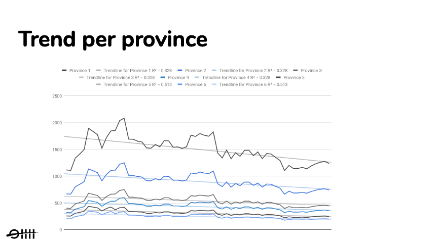
After plotting the trendline and calculating the R² per province I validated almost exactly the same trend directions in every province. The only big difference between provinces were the absolute numbers. This validation was important because of the measuring technique we wanted to apply later on. This gave me the opportunity to move forward since I was able to compare regions with each other. Now the question was, which regions are most eligible to run such an A/B test with?
Step 2 — How to choose the right regions
When I noticed that the trendlines were moving in the same direction, I wanted to know which regions had the most commonalities, so I could compare our apples with apples. For this part, I made use of the brains of my colleague and Data Scientist; meet Bob. We started with a brainstorm about which calculations we needed to do in order to find the best comparable regions. We came up with the following:
2.1 Calculate the trailing moving average
We started to analyze the data points by calculating the trailing moving average. We apply moving averages with time series data to smooth out short-term fluctuations and highlight longer-term trends or cycles. This gave us a series of averages from all different subsets of the full data set.
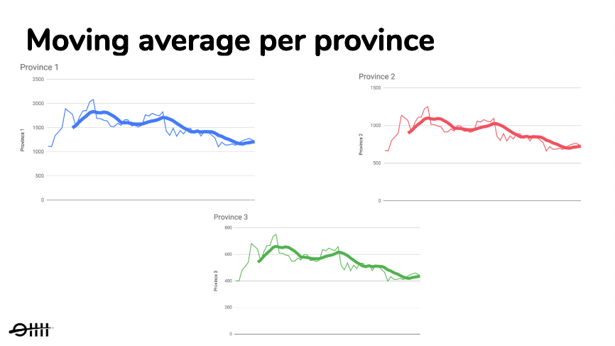
As you can see in figure 1.2, we created an overview of the moving averages per province. With the short-term fluctuations filtered out, we could better observe the different trends of every province. Next, we compared the longer-term trends with each other by plotting them into the same chart, as you can see in the next figure.
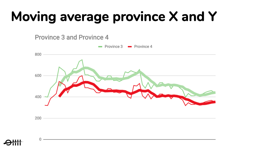
After plotting the trendlines in one chart, we stumbled on several regions with the same moving average trendline and proportionally the same absolute numbers. This was important for us because we wanted to observe a clear change in trendlines.
2.2 Calculate correlation and stationarity
After choosing two provinces based on the same moving average trendline, we double checked what we saw first by calculating the correlation coefficients. Quick heads up; the following part can be as dry as the desert. The correlation coefficients are used to assess the strength and direction of linear relationships. Because the trendlines were moving in the same direction the correlation coefficient was positive.
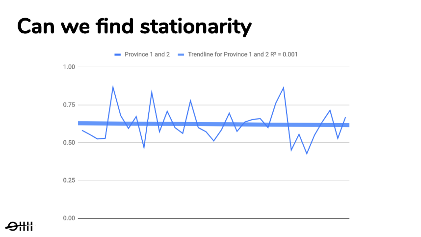
Finally, we checked for stationarity. A process is stationary when parameters such as mean and variance do not change over time (no trend nor seasonality). This is important with time series forecasting, but also in our case, since the correlation we found could be misleading otherwise.
So with the absolute numbers, we found a mean that was changing over time. But since the correlation was positive, the relative numbers between the provinces needed to stay the same. When we checked over time, province B was always x % of province A. This meant we found stationarity, as you can see in figure 1.4. (dryness is over, don’t let me say I told you so ;))
2.4 Look at external factors
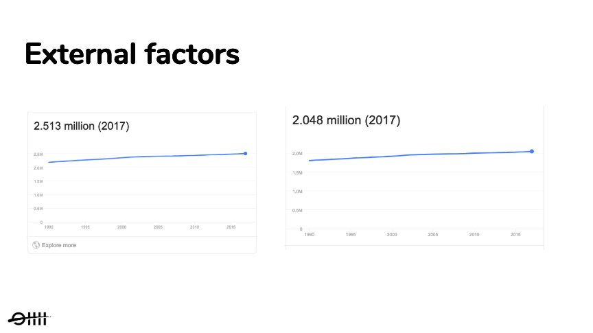
The final step was to look at external factors. We wanted to compare provinces with almost the same number of citizens. You can take this a step further to also compare political preferences, average age or population density, but for this experiment, we felt confident enough to only look at the total population numbers.
Step 3 — How to measure the impact of our brand campaign?
Now that we have chosen two provinces with identical trends and external factors we go back to our main question; can we change the trends between province X and Y and how do we know that this change is due to our brand campaign?
In order to answer this question, we ran a brand awareness campaign in province X and no brand awareness campaign in that same period in province Y and measured the following changes.
3.1 Measure change in trend and the relative numbers
We expected that during our experiment period we would see a difference occur in trendlines and this could only be the case if the trends were the same beforehand. Also, we believed the relative numbers would change and the difference would become smaller or even none at all. If this was the case we could indicate that the change in numbers was due to our brand campaign.
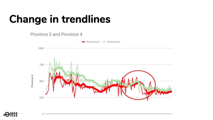
As you can see in figure 1.6, during the period of the campaign we saw a clear change occur in the trendline in one province compared to the other. What caught our attention were the absolute numbers had no difference at all during the campaign period, while after the campaign period the difference between the trendlines became less. This gave us the first real measurable insights regarding the effects of our brand campaign. Therefore we could already validate that the brand campaign had some effect. But only measuring the change in trends is not enough. How much change really occurred?
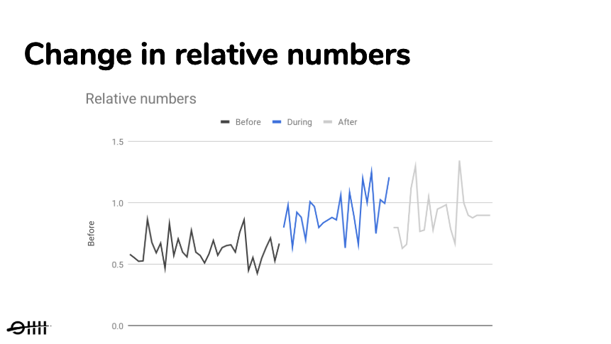
If you look at the above chart you see clear different relative numbers before, during and after the campaign period. This was an additional validation that a change occurred in the trendlines. It also gave us measurable insights about how much impact came from the brand campaign. Now we needed to measure if this change was due to our brand campaign or just random activity. This was done by measuring statistical significance.
3.2 Measurement of statistical significance
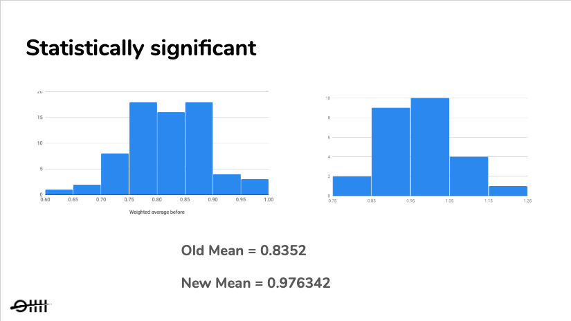
We measured statistical significance to be confident that the change that occurred was not due to random chance but due to our brand campaign. Before we could make this calculation we created a histogram from the relative numbers and calculated the standard deviation. This gave us insights about the minimal required uplift in our relative numbers in order to make our experiment statistically significant.
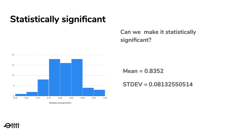
At the end of our experiment, running for 4 weeks, we created a new histogram. This histogram was based on the relative numbers from during the campaign period. Within this new histogram, the relative uplift needed to be at least 2 stdev. in order to be statistically significant. When the experiment was over we did a T-test in order to compare the means. We wanted to determine whether the effect size was statistically significant. As you can see in figure 1.9, this was the case, which meant that we could be 95% confident that this change was the result of the brand awareness campaign.
3.3 Validated or Invalidated
Now we had a complete picture of the impact of our brand awareness campaign. To summarize;
- First of all, we saw a clear change in trends between regions during and after the campaign period.
- Secondly, we were able to measure the impact of our brand campaign by calculating the relative numbers.
- And finally, the difference was statistically significant, so we were confident enough to assign the increase in metrics to our brand campaign.
Running your brand campaign experiment like this gives you the desired outcome you need: no inconclusive experiments anymore but insightful results. All these measurable changes gave us the learnings and insights we needed.
When you decide to start with this way of measuring your brand campaign, make sure you are comparing two regions with identical trends in order to measure change and statistical significance. Finally, I like to share with you which metrics you need to track during your brand campaign experiment.
Step 4 — Measuring your results
Still here? Awesome. I will try to keep it short ;). Now that you know the theory of how to measure the impact of your brand campaign, we can finally jump into conclusions. The most important question that remains is which metrics you need to monitor when you are running your province focused brand campaign. For this experiment we measured the following metrics per province:
- Brand traffic
- Total traffic
- Number of transactions
- Conversion rates
- CPA / CAC
Especially the last metric is important. You could see a great uplift in your transactions but don’t forget you spend an X amount more. But as we all know, the impact of brand campaigns are also visible after your campaign period. Therefore, don’t forget to keep measuring the above metrics for a longer period of time. For example, during the campaign period, your Cost per Acquisition (CPA) could be higher, but when you stop your brand campaign it becomes more cost-efficient later on.
Conclusion
The goal of this experiment was to understand the impact of brand awareness campaigns. And instead of only looking at ratios and total numbers we looked at changes in trends on a smaller scale. Could we influence trends and relative numbers and where these numbers statistically significant to be able to assume this was caused by the brand campaign? This technique of measuring your brand campaign could be applied to different experiments as well (not only brand campaigns). Think of experiments where measuring attribution is difficult. So the next time you think of starting a brand campaign, start on a smaller scale and apply the above technique in order to validate and learn from your experiment.
I look forward to receiving your response and thoughts on this article and our way of measuring the effectiveness of brand awareness campaigns.
